Book-tracking
Mobile App
2023
A new chapter in
book-tracking

How might we improve the user experience of
book-tracking mobile apps?
Leisure readers need updated options for book-tracking systems that more effectively represent their wants and needs, and enhance their reading experience.
ROLE
UX Designer in collaboration with one other
SCOPE
5 months
TOOLS
Figma
Google Survey
Microsoft Teams
Goodnotes
Microsoft Office
Usability heuristics
UX Honeycomb
PROCESS
Design Thinking
Desktop research
Competitive analysis
Surveys
Semi-structured interviews
Card sorting
User journey mapping
Affinity mapping
User archetypes
Independent & group ideation
Wireframing/prototyping
Thinking aloud testing
AB testing
Usability heuristic assessment


A digital library in your pocket - but is it meeting readers' needs?

Book-tracking is — at its core — a cataloguing system for the books one has read and wants to read. It also promotes reflecting on and reviewing books by documenting one’s evaluation and thoughts.
With the progression of the tech revolution, book-tracking has become accessible in the palm of one’s hand, essentially creating a digital library that can fit neatly within the reader’s pocket. This transformation empowers modern readers with a convenient way to organize and share their interests, monitor their reading habits, and discover new books.
The problem is…
users predominantly rely on Goodreads, an app that has seen minimal updates since Amazon acquired it in 2013, resulting in a suboptimal experience. Still, competing apps fail to match Goodreads’ extensive user base.
This leaves an opportunity…
to explore why Goodreads remains successful despite its flaws and to design a more intentional and intuitive book-tracking user experience. To do so, my partner and I followed an iterative design thinking framework.
Goodreads dominates, but it's far from perfect.
We began by investigating eight of the top book-tracking competitors suggested by the Insightful Reading blog and the iOS App Store, also considering manual journaling as a common method.
To compare mobile apps, we examined each platform in the US App Store, noting the listed features of those with high average ratings and numbers of ratings. We then summarized these findings in a competitive analysis table to highlight key differences.

Goodreads (dedicated book-tracking app)

StoryGraph (dedicated book-tracking app)
Bookly (dedicated book-tracking app)

Kobo Books (digital reading app with some book-tracking functionalities)

Apple Books (digital reading app with some book-tracking functionalities)
Libby (digital reading app with some book-tracking functionalities)

Amazon Kindle (digital reading app with some book-tracking functionalities)
Notes (app that enables manual book-tracking)

To truly understand users, we didn’t just settle for numbers - we listened to their stories.
-
We used Google Forms to create a survey and distributed it through university social circles and message boards. The survey included demographic questions, reading interests, and behaviors, with additional questions for current or past book-tracking users.
-
The goal of our user interviews was to gain a deeper understanding of the users beyond the online survey. To gain deeper insights, we conducted 45-60 minute in-person interviews with 5 readers from our target group. The interview guide mirrored the survey questions and included card sorting activities to understand user priorities.
The three card stacks included common features of book-tracking, potential statistics about personal reading behavior, and factors that affect book selection.
-
We analyzed Goodreads reviews from the App Store using JavaScript and the app-store-scraper library to collect data, followed by Python for sentiment analysis, keywords, key phrases, GPT-3, and word clouds. This provided a large database of app-specific opinions that each includes both a score and written feedback, providing both quantitative and qualitative data.
We also recognized that reviews often come from users with strong opinions, which often do not represent the majority of app users.


To process our data and insights, we outlined a typical reader’s user journey, inspired by Prateek Agarwal, in an online Figma whiteboard, documenting key findings on digital post-it notes and using affinity mapping to cluster insights within each phase.


As it turns out, readers want more intuitive designs and features that adapt to their habits.
Some key findings
Aside from reading, users spend the most time discovering new books, organizing collections, and rating/reviewing.
Users highly value friend recommendations, but don’t use apps for this.
Many desire an updated UI and a “Did not finish” shelf.
Users would like more flexibility in searching, sorting, and filtering the books and reviews.
Users find writing book reviews intimidating and the five-step rating scale insufficient.
“I guess it’s [reading] mostly in like periods where if I start something it might be like everyday, usually in the evening, or maybe after dinner or something, or maybe on the bus.”
“It’s [reading is] more of a personal experience”
“I think for me it started as a challenge. How many books can you actually read?”
Not all readers think alike. Here's what stood out to us.


Read more about the 6 dimensions of
reader characteristics below
-
We found that readers exist on a spectrum of how social they are with their reading. On one end, Social readers are more likely not only to discuss the books they've read, but also to be interested in seeing what their friends are currently reading, and to publicly rate or review books.
On the opposite end of the spectrum, Intimate readers view reading as more of a private experience with themselves. They might still analyze or contemplate the books but only independently. -
We find that most readers fall into one of the following three categories in regard to their reading frequency: Occasional, Frequent, and Binge readers.
Occasional readers spend two days per week or less reading.Frequent readers are the most consistent, reading more or less everyday.
Binge readers tend to go through periods of reading often and periods of reading very little, e.g., they might read daily for two weeks and then stop reading for two months.
-
The vast majority of readers in our research reads print books whether exclusively or inclusively with other formats. The largest difference that we saw was whether they read digital formats (e-books, audio-books) in combination with print books (Combination readers) or exclusively print books (Print-only readers).
-
On one end of the continuum, Active readers are more likely to annotate, take notes, do external related research, and engage with the book outside of just reading.
On the other end, Passive readers tend to stick simply to reading and internally digesting the content of a book without taking external action.
-
As implied in the expression “reading for pleasure'', we confirmed that all readers seek out enjoyment, relaxation or entertainment from reading. We identify these as Recreational readers.
However, we found that some readers exhibit additional layers of purpose behind their reading, whether it's to learn something new, to meet a target number of books, to develop oneself, etc. We refer to those readers as Goal-oriented. -
Readers' book preferences range greatly, which makes categorizing readers by preferred individual genres infeasible. However, we managed to group them into three broad taste categories: Mainstream, Fixed, and Exploratory readers.
Mainstream readers tend to follow common trends, bestseller lists, or generally popular and well-known books.
Fixed readers seek and enjoy specific qualities in the books they read, rarely venturing into new territories of books; their choices can be based on, e.g., book genre, topic, or author.
Exploratory readers are somewhat opposite of Fixed readers, as they enjoy exploring books completely new to them and outside their “reading comfort zone''.
During interviews, we noted polarized behaviors, needs, and goals among users, such as discussing books with friends or participating in reading challenges. To address this, we established various archetypes by identifying key divergent characteristics and narrowing them down to six dimensions, resulting in five reader archetypes.

These readers are generally proactive and serious about their reading practice. They do not usually feel confined to one set of genres and they are eager to learn from the books they read or gain new perspectives.

These readers are considered slightly more conventional. They appreciate the physicality of print books and the sensory experience that goes along with them. They are not often concerned with sharing their reading experience with other people and while they read frequently, they prefer to not add further pressure to their reading by attaching additional goals or expectations to it.

Readers who are Trend-seekers are generally tuned in to social media and are thus social readers by nature. These readers are often relying on recommendations online and bestseller lists to choose their next book. They can be driven by various goals such as being able to discuss popular books with friends or hitting certain reading goals by the end of the year.
These readers are those who read occasionally with the goal of bettering themselves in some way, whether professional, personal, or otherwise. They tend to see reading as more of an intimate experience and gravitate towards fixed categories, such as self-development books.

These readers are essentially new to the hobby but are making an effort to improve their habits over time. While some novice readers may like the social aspect of reading, many consider reading to be a more personal activity. They also generally tend to read popular or mainstream titles, as these can be considered more "trustworthy" to Novice readers.
One app's attempt at fixing Goodreads' flaws led us to narrow our focus.
We refined our competitive analysis table with insights from our research, highlighting opportunities for improving the user experience. Notably, StoryGraph addresses many complaints about Goodreads but has underdeveloped features due to rapid implementation.

This realization led us to narrow our focus in order to prioritize quality of solutions over quantity of solutions. We learned that managing collections and evaluating books, both core functions of book-tracking, presented the most opportunity for improvement. Managing collections is often overly complex, limited, and unclear. The process of evaluating books is either considered rigid and inflexible or difficult to navigate and confusing, depending on the platform used.

With this in mind, we narrowed our scope and specified our problem statement to ask:
How might we make managing collections and evaluating books more intuitive, flexible, findable, and easy to navigate for both new and existing book-tracking users between the ages of 18 and 35?
These terms were derived from user needs and validated using Peter Morville's Honeycomb.
We ideated. We prototyped. We tested. Then we did it all again.
During our user research, we maintained an “idea parking lot” to quickly document ideas that sparked either within us or within the users we connected with. These initial ideas stimulated independent brainstorming sessions focused on improving collection management and book evaluation, which then evolved into collaborative sessions where we clustered ideas by theme and selected those we were most curious to test.


My design partner and I then used these initial ideas to stimulate independent brainstorming sessions (see left) on how to improve the collection management system and the book evaluation process, which evolved into a collaborative brainstorming session where we also began clustering the ideas by theme (see right).


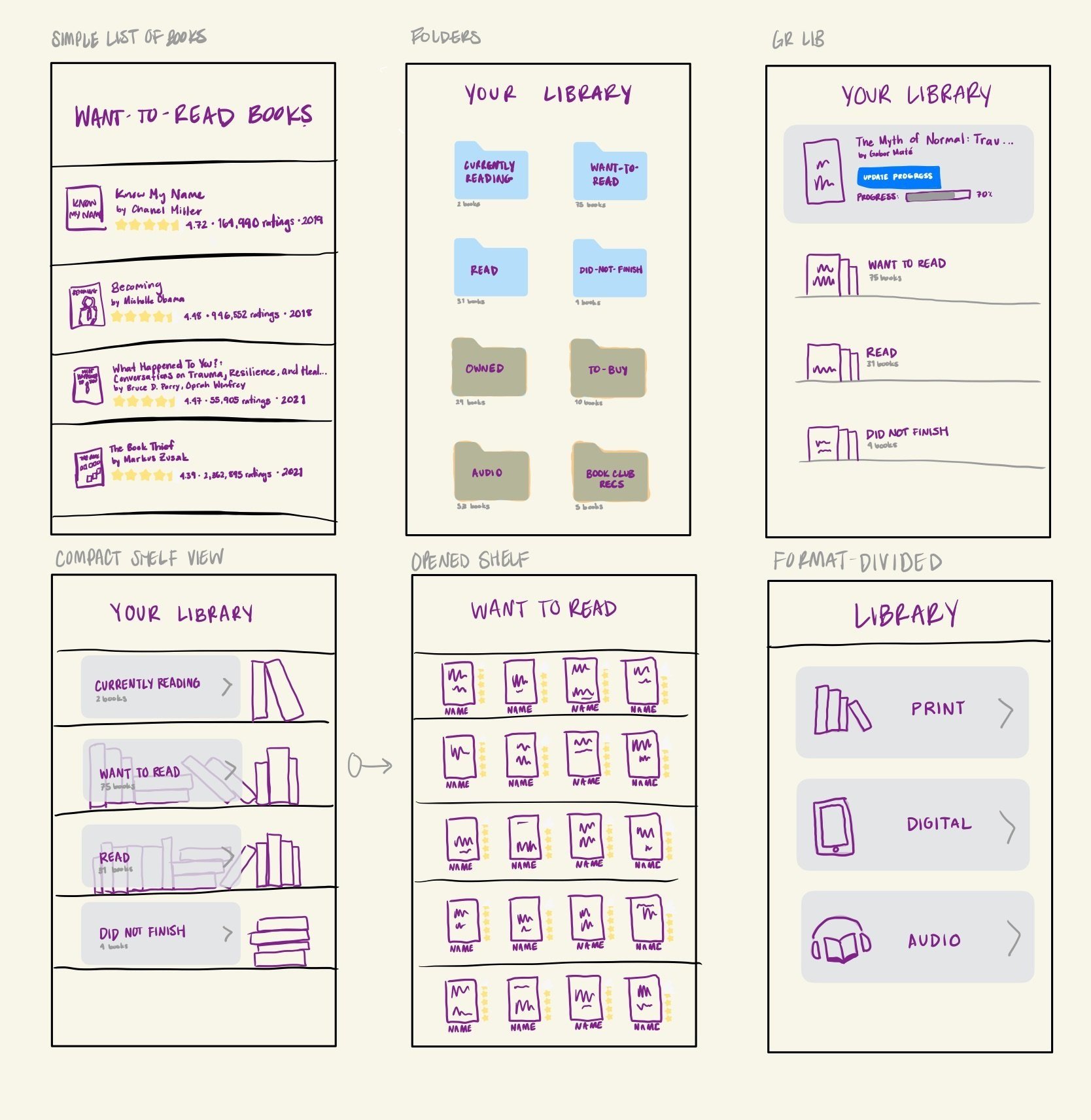
We sketched various ideas to quickly gather user feedback, then started to iterate on Figma. In total, we generated five iterations of our solution, following a build-measure-learn cycle.


Our user-testing plan involved:
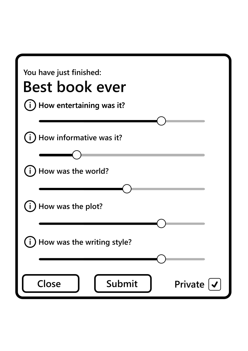
Archetype Survey: Classifying users based on our five archetypes provided us with better context for their feedback.
Think-Aloud Tests: Users performed tasks while vocalizing their thought process, allowing us to observe interactions and identify what worked well.
AB Testing: We consistently tested multiple versions of features to see how users interacted with each.


Archetype survey template
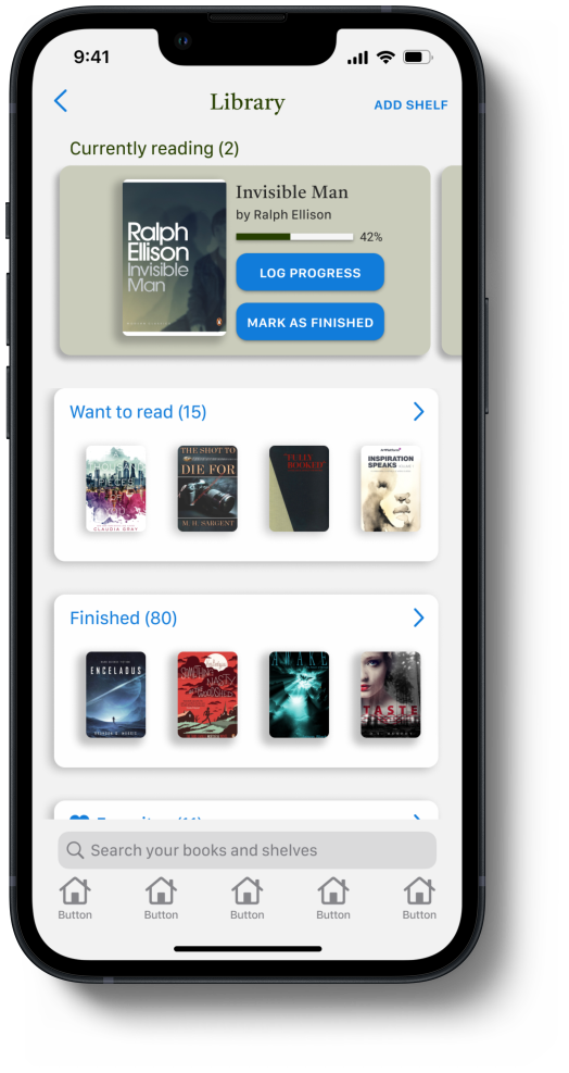
The following screens showcase the fifth and final iteration of our solution, which focuses specifically on the collection management and book evaluation processes in book-tracking. This page displays screens associated with collection management.
Our solution empowers readers with more flexibility and control over their book-tracking experience.


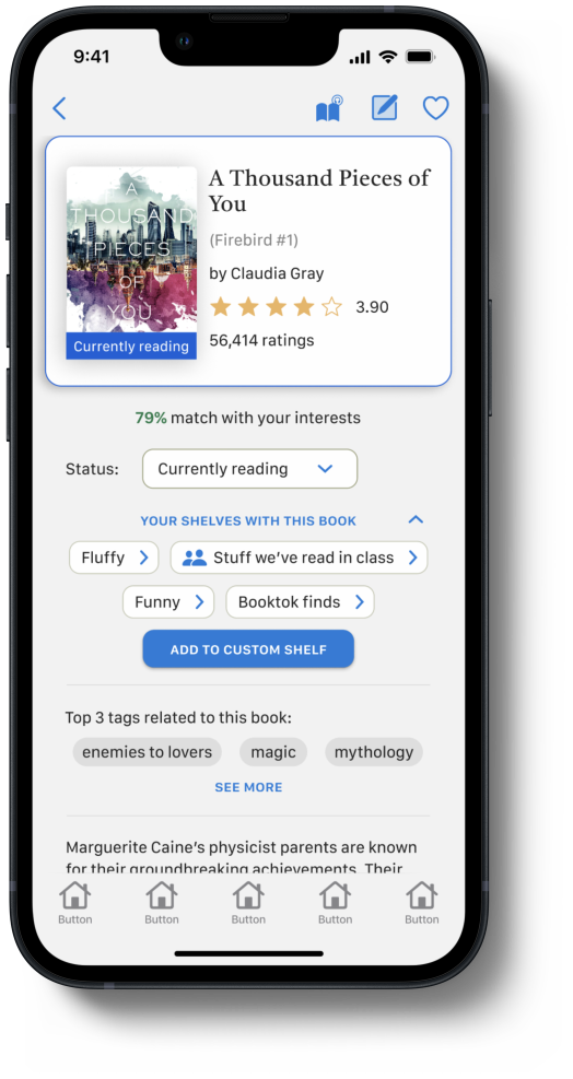


In the Library, users are able to browse shelves, add new ones, or search their saved books by title or author name. There are four default shelves (”Currently reading”, ”Want to read”, ”Finished”, and ”Did not finish”) and additional custom shelves created by the user. The ”Currently reading” card at the top allows users to quickly perform common actions on their current books, which are logging progress and marking them as ”finished”.
Once inside a collection or shelf, users can sort the books by several predefined criteria, search, and filter them. At the top of the page, the user is shown a book recommendation which is based on the shelf contents. The ability to control privacy appeared frequently in our user research and is not well- supported in existing book-tracking platforms, so it’s also possible to change this aspect of the shelf at the top of the screen.
Users can sort the books in a shelf by several predefined criteria (e.g., title or author), search them, and filter by e.g., genres or tags.
Another commonly occurring theme, which is novel to our solution, was the concept of context information or quick-notes about the books. These are visible and editable directly from the Shelf view.
Shared shelves allow users to see and edit the contents of the shelves together. This shelf looks similar to others in terms of book presentation, but instead of displaying the rating and the private quick-note, it includes a recommendation note provided by the user who added the book to the shelf, and a button to quickly add it to one’s personal ”Want to read” shelf. Collaborators can also ”Like” the book or discuss them in the comments.
In the Book Information page, users can move the book between the 4 default shelves (”Want to read”, ”Currently reading”, ”Finished”, and ”Did not finish”) using a status dropdown menu. Below, there is a section showing the users' custom shelves. On this page, users can also change book format, access their quick-note, and add the book to their ”Favorites” shelf using the icons on the right side of the header.
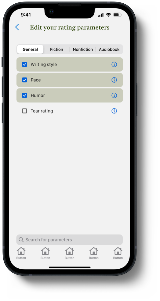
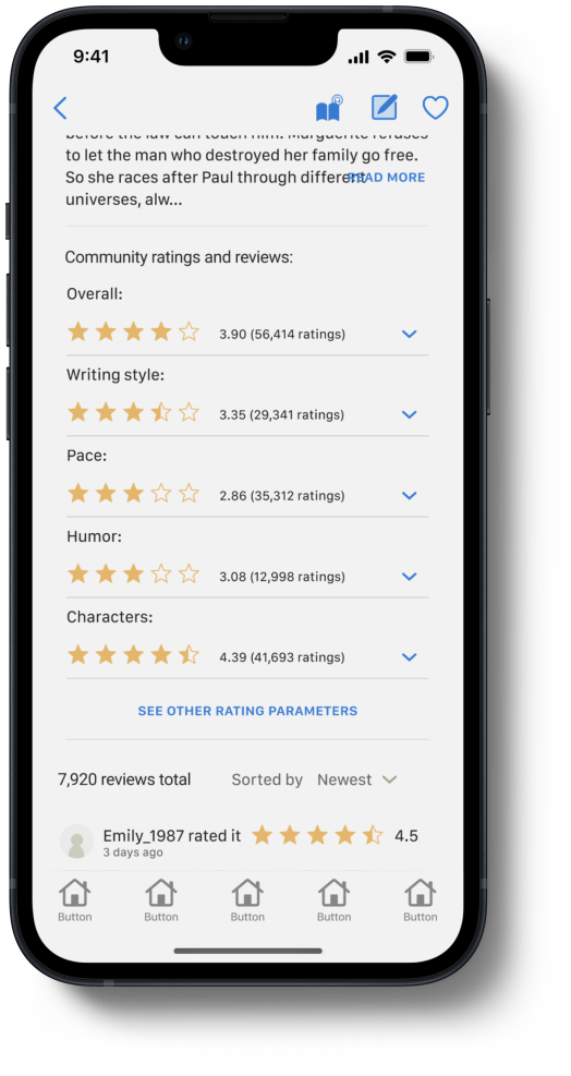
This is a scrolled down view of the Book Info page. In our solution, users are not only able to rate books with an overall score (as currently exists in most book-tracking platforms) but also with secondary rating parameters, which target more specific qualities of the book.
This image displays the status dropdown menu previously mentioned to allow users to assign the book to a default shelf depending on its status.
The feedback provided once the user adds a book to their "Want to read" shelf includes a distinctly colored outline and banner on the bottom of the book cover.
The feedback provided once the user adds a book to their "Currently reading" shelf includes a distinctly colored outline and banner on the bottom of the book cover.
The feedback provided once the user adds a book to their "Finished" shelf includes a distinctly colored outline and banner on the bottom of the book cover. It also includes a section related to the user's own rating of the book (or lack thereof).
The Evaluation page can be divided into two major sections - the top consists of the interactive star ratings (primary and secondary) and the bottom displays a text box used to input the user’s book review, as well as the review’s privacy settings. While the ratings display a five-step scale, it is possible to input half stars, essentially making the scale ten steps.
As is done in StoryGraph, these secondary rating parameters focus on separate aspects of the book that users can rate independently from the overall rating. Unlike in StoryGraph, however, with our solution users have control over deciding which of the parameters they deem relevant for the given book and can select them through this dedicated menu.
Instead of guiding users through a lengthy step-by-step process like in StoryGraph, we help them by providing optional review prompts, which users can access using the button right above the text field in the Evaluation page. These questions allow users to better articulate their thoughts while writing their review. After tapping a question, users are redirected back to the previous page where the prompt is then displayed above the text field.
Below the text field on the Evaluation page, users can specify the privacy of their rating/review using the dropdown menu.
Once the user has submitted their own rating and review, it appears displayed on the Book Info page, along with the feedback that the book is "Finished".
We tested our final interactive Figma prototype with 5 users using:
Think-Aloud Tests: Guided tasks to observe user interactions.
Surveys: NASA TLX, SUS, and a custom survey addressing our problem statement.
Usability Assessment: Jakob Nielsen’s 10 Usability Heuristics for User Interface Design.
The final prototype received positive feedback, but testing with surveys was trickier than we expected.

Key findings


Weaknesses
(3) User control and freedom (e.g., consistent cancel and undo buttons)
(5) Error prevention (e.g., preventing accidental "finished" marks)
(8) Aesthetic and minimalist design (e.g., overall design update)
Think-Aloud Feedback: Most changes made in previous iterations resolved usability issues. Overall experience was smooth, although some tasks did elicit confusion.
Survey Results: NASA TLX and SUS scores were favorable, indicating overall usability. However, the surveys provided limited insights due to a lack of comparative data and the small sample size.
Custom Survey: Highlighted "flexibility" as the most successful aspect, reflecting user satisfaction with the freedom to express views and preferences.
Usability performance highlights
Strengths
(1) Visibility of system status
(4) Consistency and standards
(6) Recognition rather than recall
(7) Flexibility and efficiency of use
(10) Help & documentation


This project emphasized that thoughtful user research leads to clearer, more focused solutions.
While our solution is not a full application and is not without limitations, we recognized through testing and closely considering how it fulfills the four objectives in our original problem statement (intuitive, flexible, findable, and easy to navigate) that it provides a compelling example of how we might foster a better user experience in book-tracking. We also see various ways in which our solution would benefit from further development, which suggests that future iterations can have even more promising results, impacting book-tracking and reading as a whole.
User research takes time (obtaining, processing, and analyzing data) and should not be rushed. It’s worth spending the time to understand users. It should also continue all throughout the design process.
Vague problems lead to vague solutions. A good problem statement is specific without being overly restricting.
Fail fast. Not all ideas are good ideas. It’s better to find this out early on rather than after spending a lot of time developing something.
Be intentional about your testing methods and don’t omit quantitative testing. It gives you more clear indications about which aspects can be improved and how.
MVP vs features. Approaching the problem from a bigger picture perspective rather than hitting individual features in new ways would make the solution stand stronger as a whole.